浅学 Flex 流式布局
Flex(Flexible Box)流式布局,用于为盒装模型提供较大的灵活性。任何容器都可以被指定为 flex 布局:display: flex 或 display:inline-flex。本文主要参考菜鸟教程及阮一峰老师的FLEX教程。
一、简介
基本概念
采用 Flex 布局的元素被称为 Flex 容器(container),它的所有元素会自动成为容器成员,成为 Flex 项目(item)。容器中默认存在两根轴:水平主轴(main axis)和垂直的交叉轴(cross axis),主轴开始的位置叫做 main start,结束的位置叫做 main end;交叉轴类似。项目默认沿主轴排列,单个 item 占据的主轴空间叫做 mian size ,占据的交叉轴空间叫做 cross size;
容器属性
flex 容器可以已配置以下六个属性flex-direction、flex-wrap、flex-flow、justify-content、align-items、align-content。
flex-direction决定主轴的方向row水平向右row-reverse水平向左column垂直向下column-reverse垂直向上
flex-wrap决定 item 的换行方式nowrap不换行wrap向下换行wrap-reverse向上换行
flex-flowflex-direction和flex-wrap结合- 默认:
flex-flow: row nowrap
- 默认:
justify-contentitem 基于主轴的对齐方式flex-start(默认值):左对齐flex-end:右对齐center: 居中space-between:两端对齐,项目之间的间隔都相等。space-around:每个项目两侧的间隔相等。所以,项目之间的间隔比项目与边框的间隔大一倍。
align-itemsitem 基于交叉轴的对齐方式flex-start:交叉轴的起点对齐。flex-end:交叉轴的终点对齐。center:交叉轴的中点对齐。baseline: 项目的第一行文字的基线对齐。stretch(默认值):如果项目未设置高度或设为auto,将占满整个容器的高度。
align-content多根轴线的对齐方式flex-start:与交叉轴的起点对齐。flex-end:与交叉轴的终点对齐。center:与交叉轴的中点对齐。space-between:与交叉轴两端对齐,轴线之间的间隔平均分布。space-around:每根轴线两侧的间隔都相等。所以,轴线之间的间隔比轴线与边框的间隔大一倍。stretch(默认值):轴线占满整个交叉轴。
项目属性
以下六个属性设置在 item:order、flex-grow、flex-shrink、flex-basis、flex、align-self。
order定义项目的排列顺序,越小越靠前,默认为0。flex-grow定义项目的放大比例,默认为0flex-shrink定义项目的缩小比例,默认为1如果所有项目的
flex-shrink属性都为1,当空间不足时,都将等比例缩小。如果一个项目的flex-shrink属性为0,其他项目都为1,则空间不足时,前者不缩小。flex-basis定义在分配多余空间之前,项目占据的主轴空间(main size)它可以设为跟
width或height属性一样的值(比如350px),则项目将占据固定空间。flex属性是flex-grow,flex-shrink和flex-basis的简写,默认值为0 1 auto。该属性有两个快捷值:
auto(1 1 auto) 和 none (0 0 auto)。建议优先使用这个属性,而不是单独写三个分离的属性,因为浏览器会推算相关值。
align-self允许单个项目有与其他项目不一样的对齐方式,可覆盖align-items属性。默认值为auto,表示继承父元素的align-items属性,如果没有父元素,则等同于stretch。
二、实战
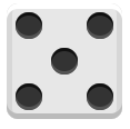
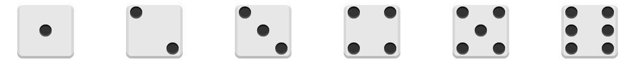
类似于骰子的布局,它的一面最多可以放九个点,该案例将会实现1-6的点数。
准备
开始准备工作,如下方部分 HTML 代码,container为主体部分,face-n 代表数字 n 的骰子,pip 为一个点。
<div class="container">
  <div class="face-1">
    <span class="pip"></span>
  </div>
    ...
  <div class="face-4">
    <!-- 4、6 需要分为两列,5需要分为三列-->
    <div class="colum">
      <span class="pip"></span>
      <span class="pip"></span>
    </div>
    <div class="colum">
      <span class="pip"></span>
      <span class="pip"></span>
    </div>
  </div>
  ...
</div>
然后,我们为这些基本元素编写样式:
* {
    margin: 0;
    padding: 0;
}

.container {
    display: flex;
    justify-content: space-around;
    flex-wrap: wrap;
}

.pip {
    display: block;
    width: 24px;
    height: 24px;
    border-radius: 50%;
    margin: 4px;

    background-color: #333;
    box-shadow: inset 0 3px #111, inset 0 -3px #555;
}

[class^="face"] {
    margin: 16px;
    padding: 4px;

    background-color: #e7e7e7;
    width: 104px;
    height: 104px;
    object-fit: contain;

    box-shadow: inset 0 5px white,
    inset 0 -5px #bbb,
    inset 5px 0 #d7d7d7,
    inset -5px 0 #d7d7d7;

    border-radius: 10%;
}
在浏览器中运行,我们便可以得到如下效果:
实现
.face-1 {
    display: flex;
    justify-content: center;
    align-items: center;
}.face-2 {
display: flex;
justify-content: space-between;
.pip:nth-of-type(2) {
align-self: flex-end;
}
}.face-3 {
display: flex;
justify-content: space-between;
.pip:nth-of-type(2) {
align-self: center;
}
.pip:nth-of-type(3) {
align-self: flex-end;
}
}.face-4 {
display: flex;
justify-content: space-between;
flex-direction: column;
.colum {
display: flex;
justify-content: space-between;
}
}.face-5 {
display: flex;
justify-content: space-between;
flex-direction: column;
.colum {
display: flex;
justify-content: space-between;
}
.colum:nth-of-type(2) {
justify-content: center;
}
}.face-6 {
display: flex;
justify-content: space-between;
.colum {
display: flex;
justify-content: space-between;
flex-direction: column;
}
}效果如下
项目源码可以在 A Pen by mufeng (codepen.io) 看到,感谢您的支持。